Google is Testing Bottom Toolbars for Play Store and Google Keep.
Google has always been keen on improving user experience on Google apps by redesigning them with regular updates and adapting to modern smartphones and user demands. Although it’s not always been successful, Google continued to change some of its app features and interfaces. Even this time, it doesn’t seem it is 100% to the benefit of the user as Google is testing bottom toolbars for Play Store and Google Keep apps.
How to Minimize Web Pages to PiP Mode on Android
Search Button in the Bottom Toolbar
The Google Play Store will have a new button in the bottom toolbar and four existing 4 buttons (Games, Apps, Offers, and Books). That new button is the “search” button which will be added in the center of the bottom tab instead of the search bar at the top of the screen. This makes it easy to reach out for the search button if you are using a phone with a huge screen. But the catch is that the search bar will be the same as before when you open a new tab or when you click on the new search button.
New Dedicated Search Tab in the Play Store
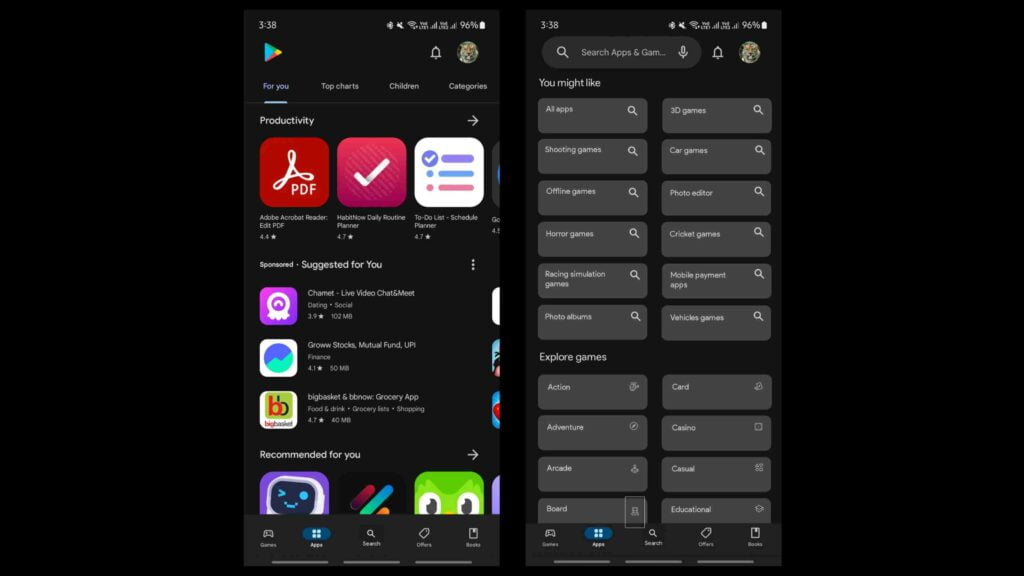
After clicking on the search button, a separate search tab will be opened with 2 sections – “You might like”, and “Explore games”. These two sections will have categories of apps and game genres accompanied by search icons and relevant icons for Game genres. These suggestions might vary based on your Play Store search history and download history. You’ll have to again tap on the category or genre you want to search or search directly on the top search button by typing your query as you did before this update. Google gave a good redesign by bringing down the search button to the bottom bar, but kind of ruined it by making search a double-tap process.
The Play Store logo will replace the old top search bar at the top left edge with the notification bell and your profile icon at the top right end. Other sections won’t be getting a major revamp that’s worth mentioning.
This update reportedly is rolling out with the PlayStore version 40.1.19-31 via a server-side update. It’s not widely released yet, so don’t worry if you don’t have it yet. The update is still in the testing stage but Google seems to be sticking to this design as per speculations.
Floating Bottom Toolbar in Google Keep
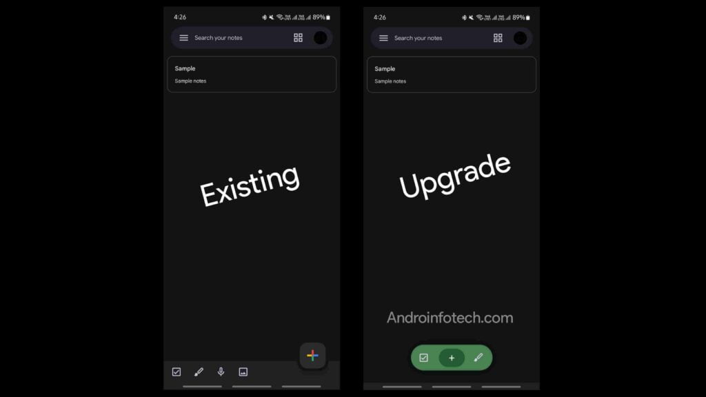
Another Google app that’s getting a revamp is Google Keep. According to the speculations from reliable sources, Google Keep will be getting a floating bottom toolbar similar to Google Chat. The existing toolbar has five buttons and covers the whole bottom width of the screen. This new floating toolbar will replace it with three buttons – a note-taking button, a list-creating button, and a creating a picture or drawing note button. Two buttons (voice button, and picture button) in the current toolbar will be removed and made accessible somehow in the app hopefully.
The official announcement regarding the revamp of Google Keep is yet to be made by Google. But if you want to try this now, your device has to be rooted. You can try the new floating toolbar by adding the following flag uai g GMS flags app.
• Package – com.google.android.keep#com.google.android.keep
• Flags – 45618251
Wrapping Up
The Play Store search button in the bottom toolbar is a great revamp, but making search a double-tapping process is not. It would have been a great revamp if we could directly launch the search bar with the keyboard by tapping on the search button. The Google Keep redesign also seems good, but removing the two existing buttons is not a good move. I hope we can access them by double-tapping on the plus button or in some other way. Let me know your thoughts on these revamps in the comments.


